
Labyrinth Readers Society
Industry: NGO l Discipline: Branding, Digital
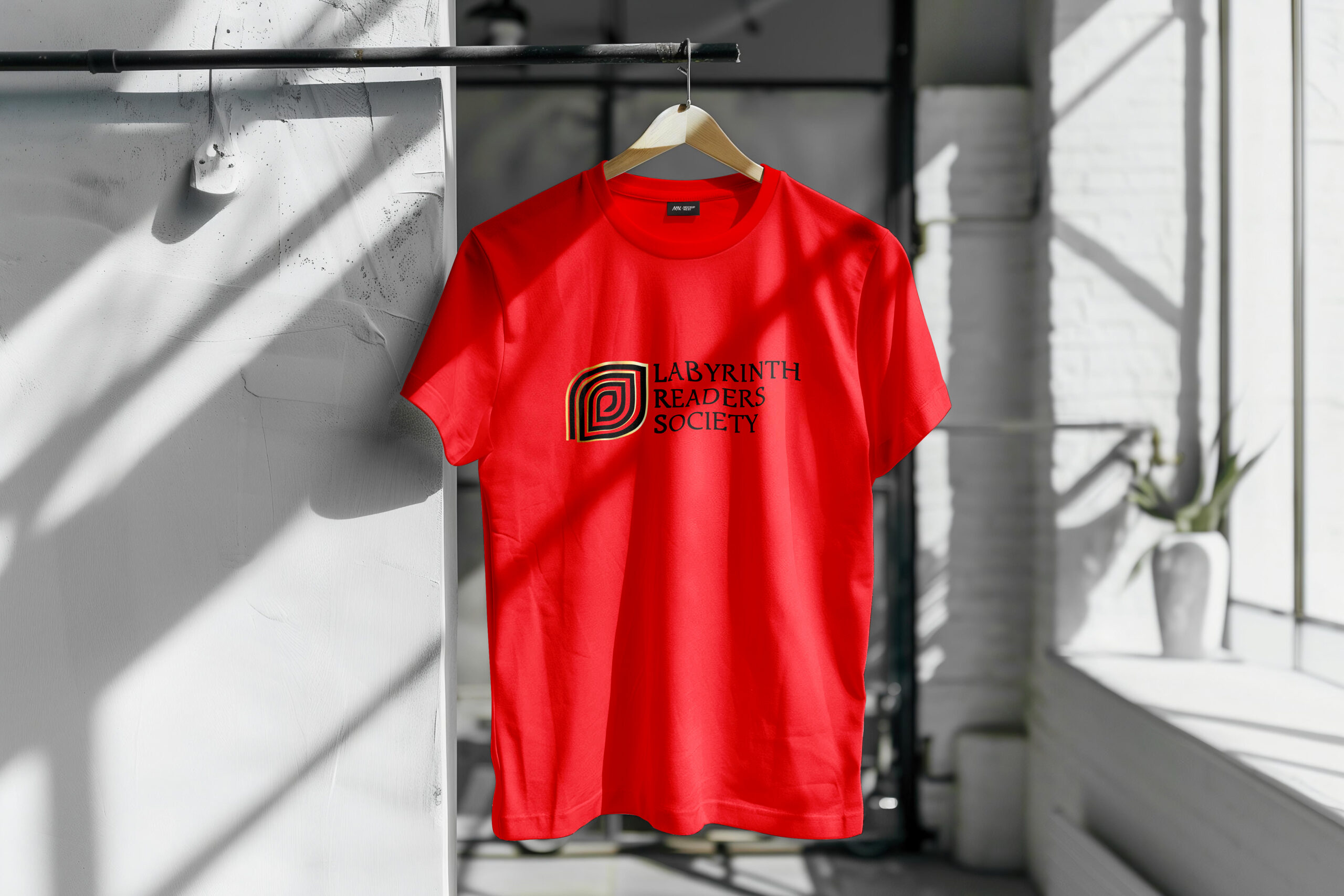
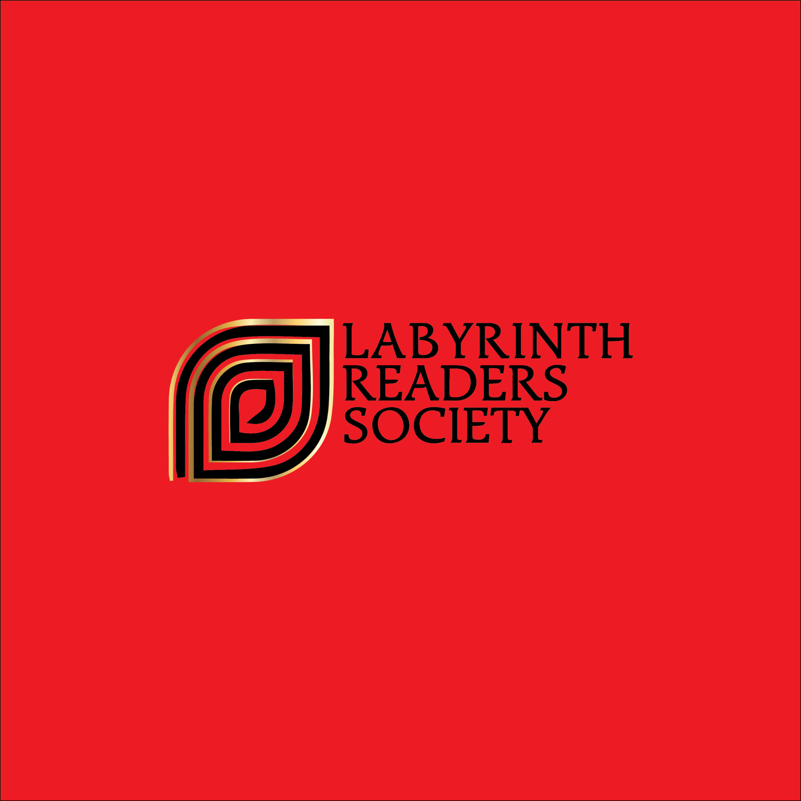
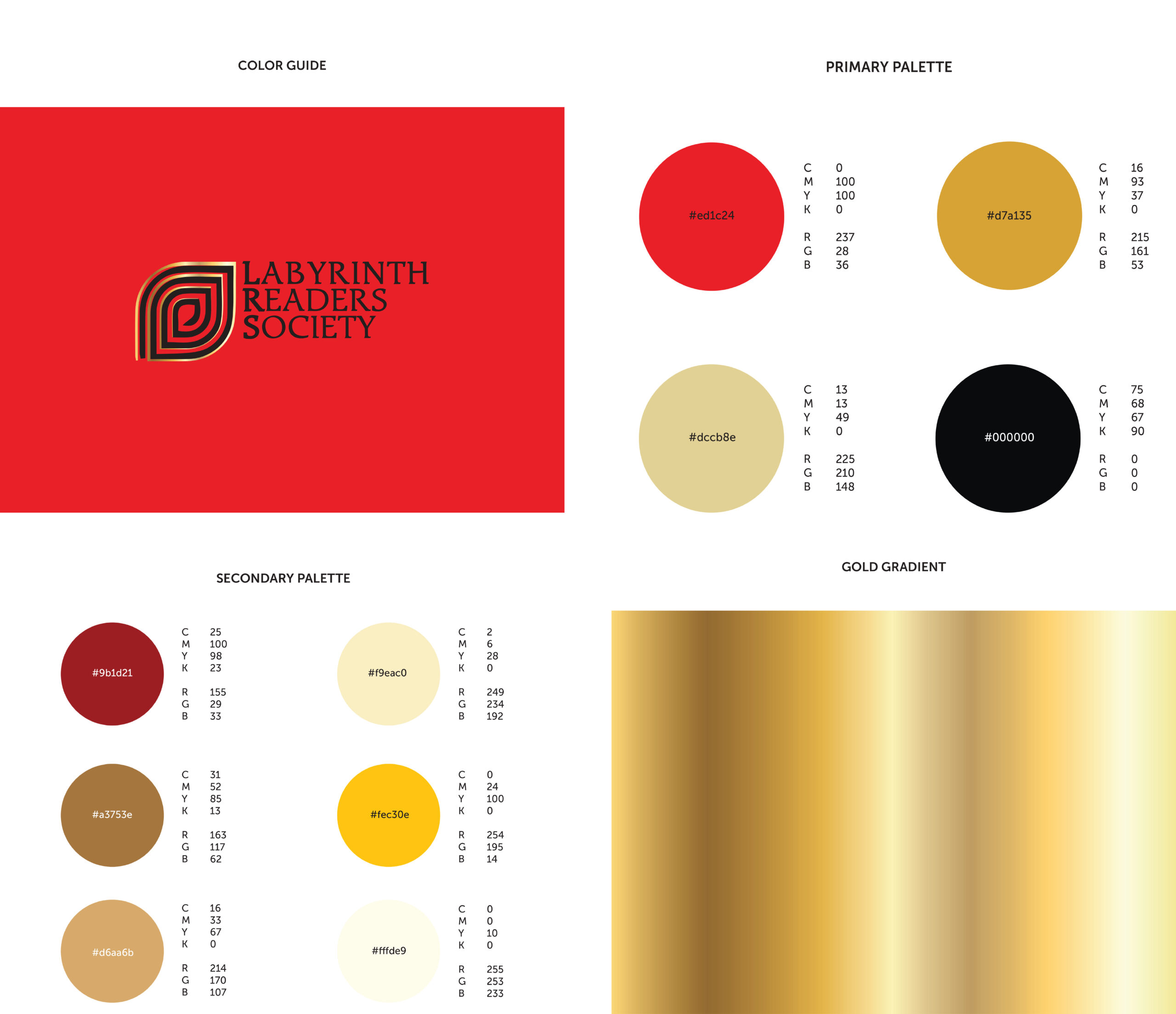
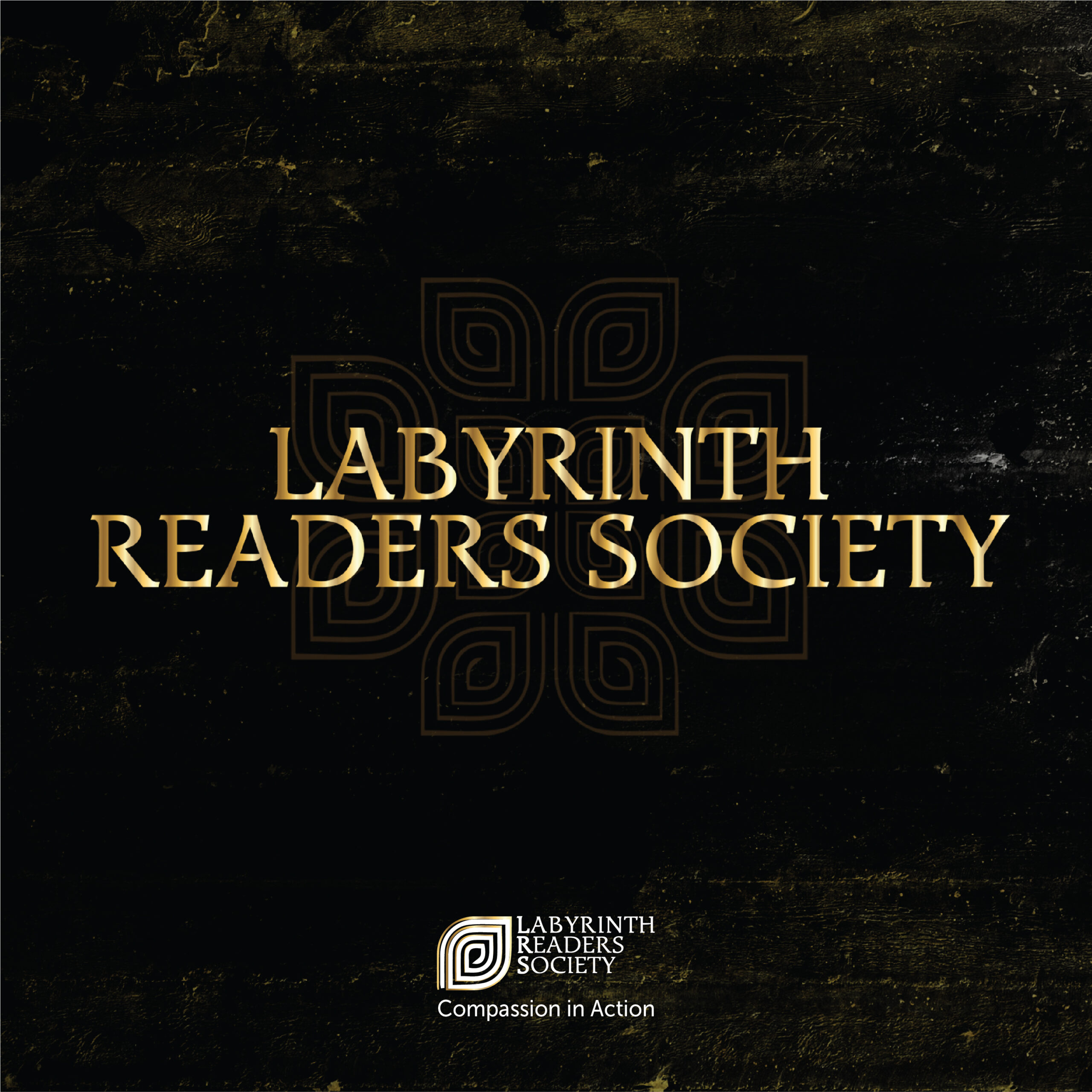
This non-profit approached us to develop a new brand identity for their long-established forum. They wanted a refined yet modern aesthetic while maintaining a sense of heritage, using a limited color palette of red, black, and gold to reflect both tradition and sophistication.
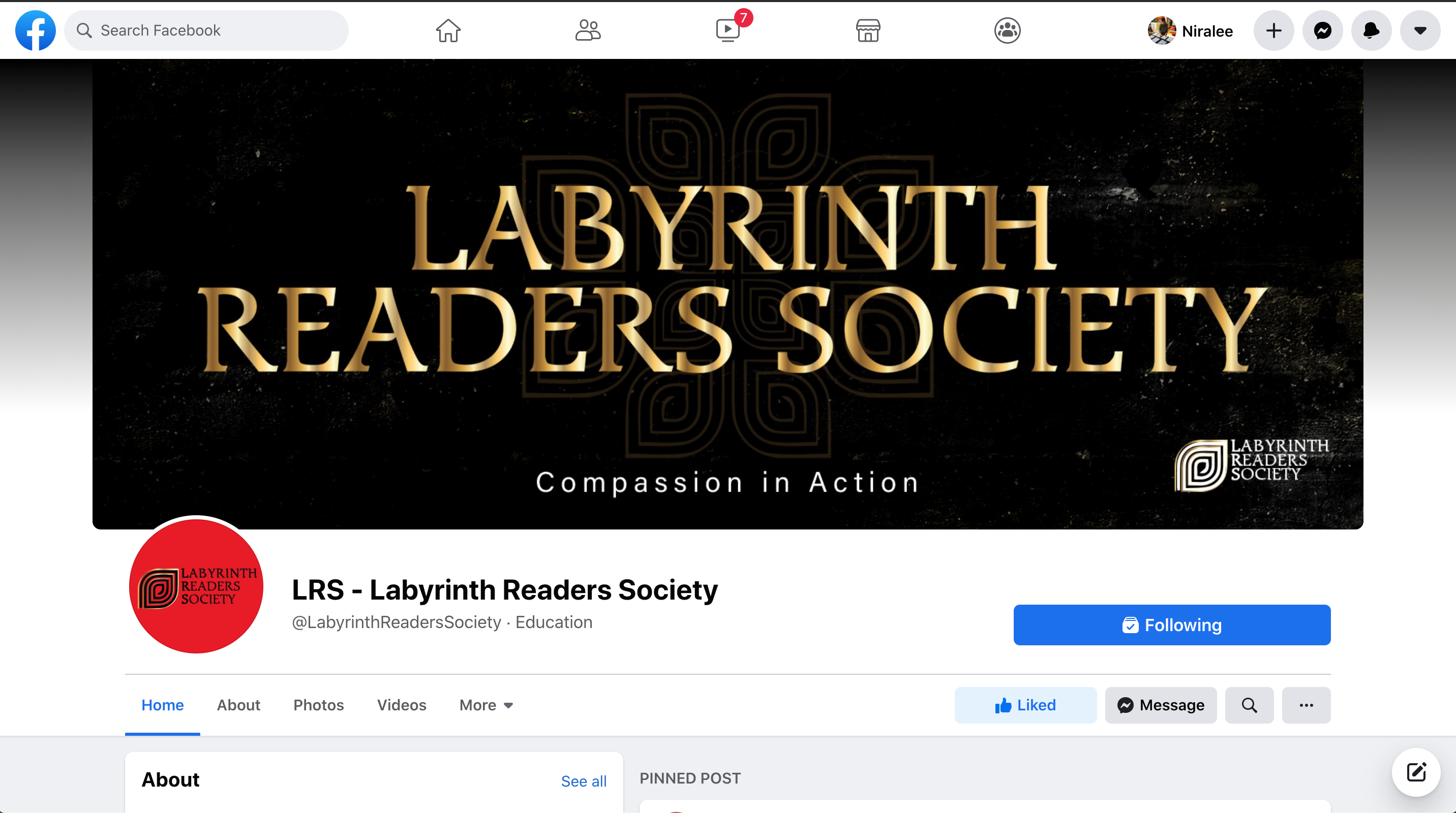
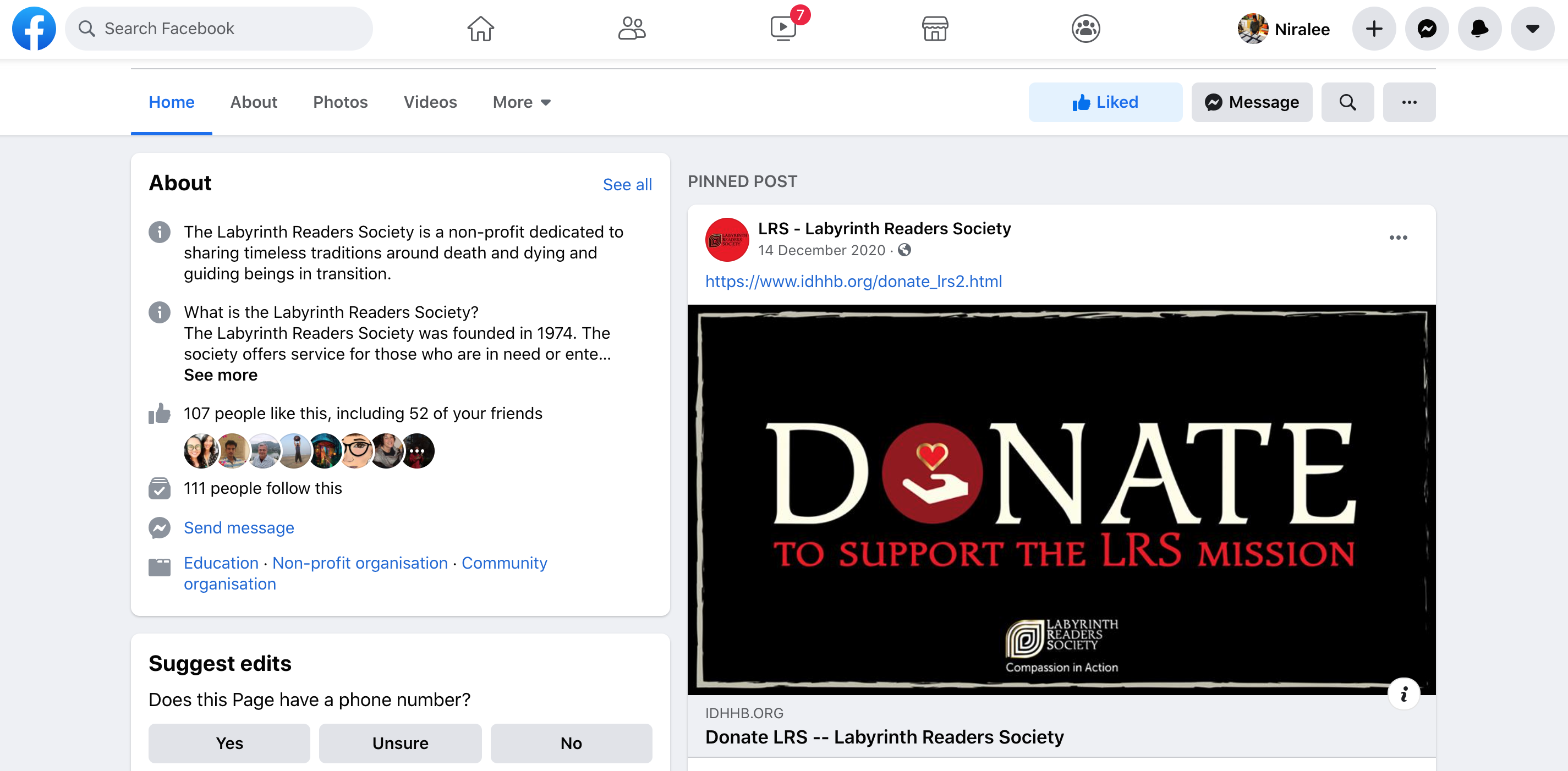
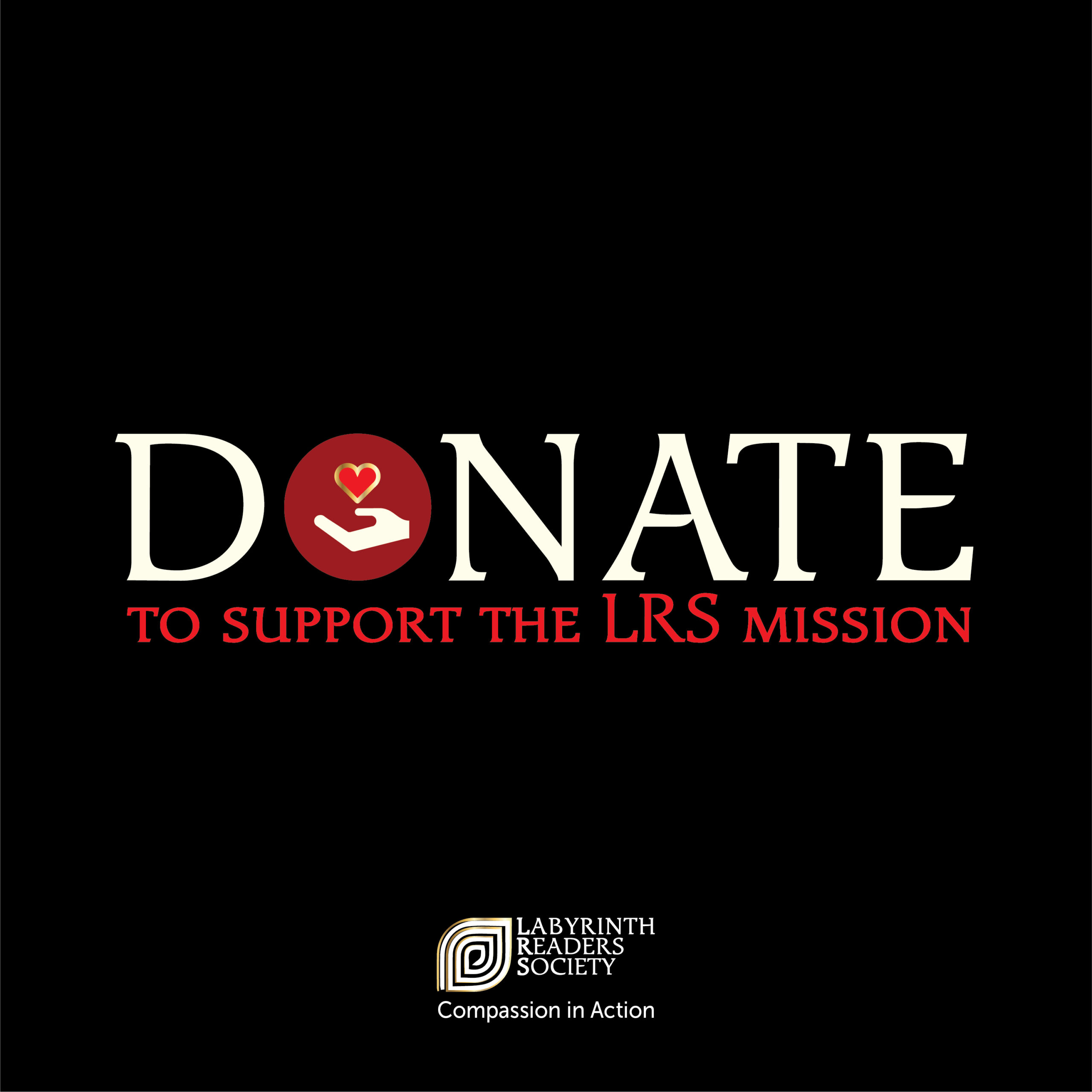
We brought this vision to life by incorporating bold typography with an ancient-inspired style. The icon was designed around the concept of a ‘labyrinth’—symbolizing a maze—rendered in gold to evoke a sense of regality and set against a striking red background for maximum impact. To extend the brand’s visual identity, we transformed the logo into a pattern and integrated it into the forum’s Facebook timeline cover, layering it over a cosmic-textured background to create a timeless, immersive feel.