
Supergigs
Industry: IT l Discipline: Branding, Digital
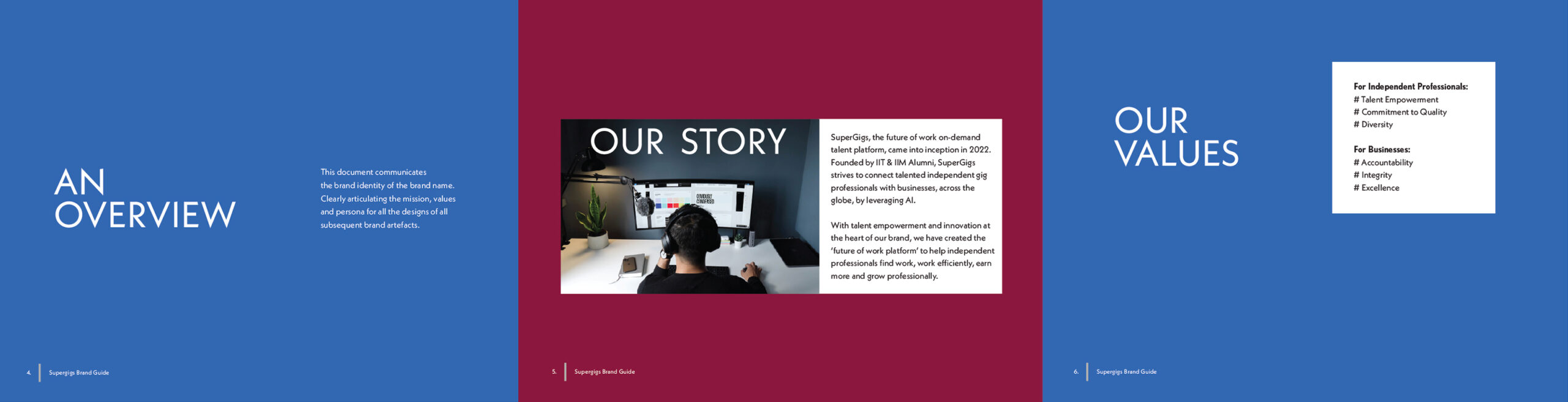
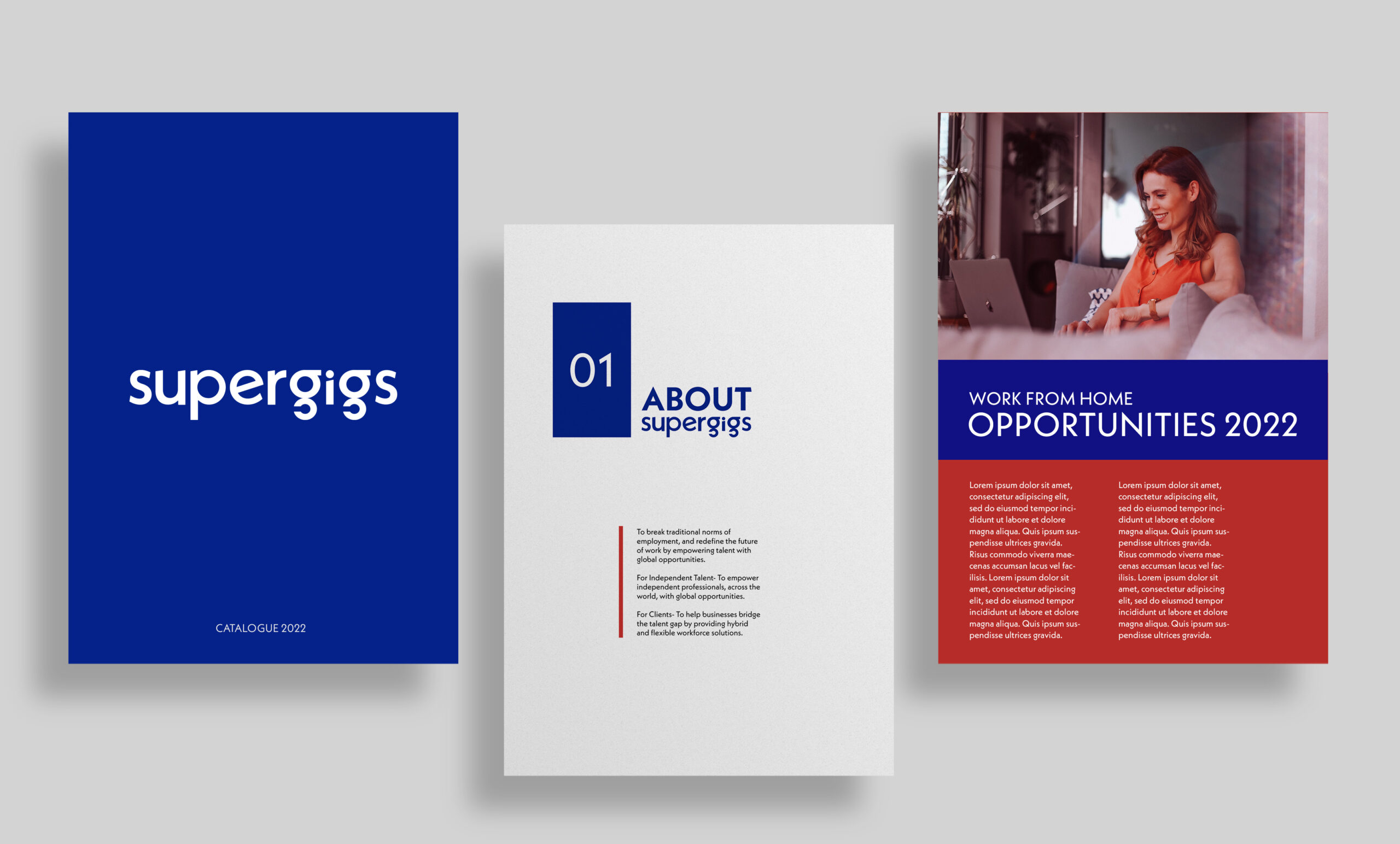
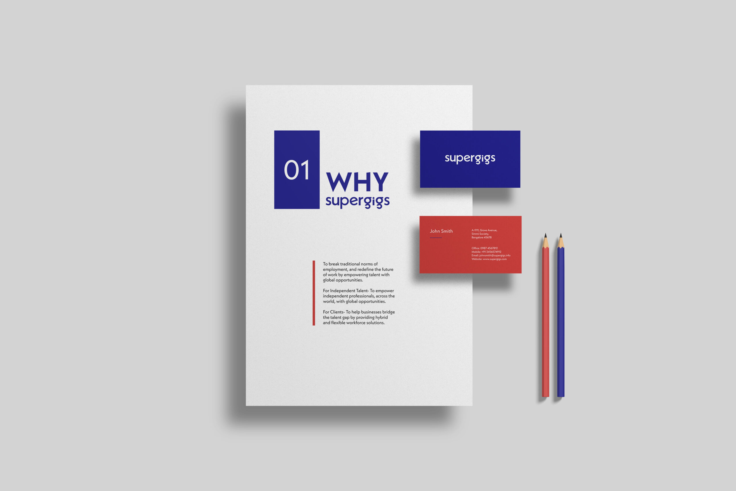
This project came from the same client who owns multiple businesses. They were launching a new recruiting firm and wanted a brand identity that conveyed strength and impact. The idea behind incorporating “super” into the firm’s name was to evoke a superhero vibe.
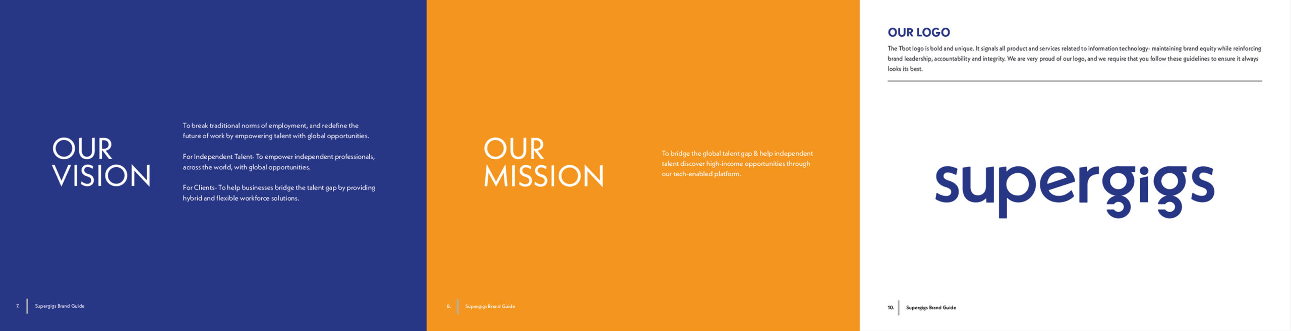
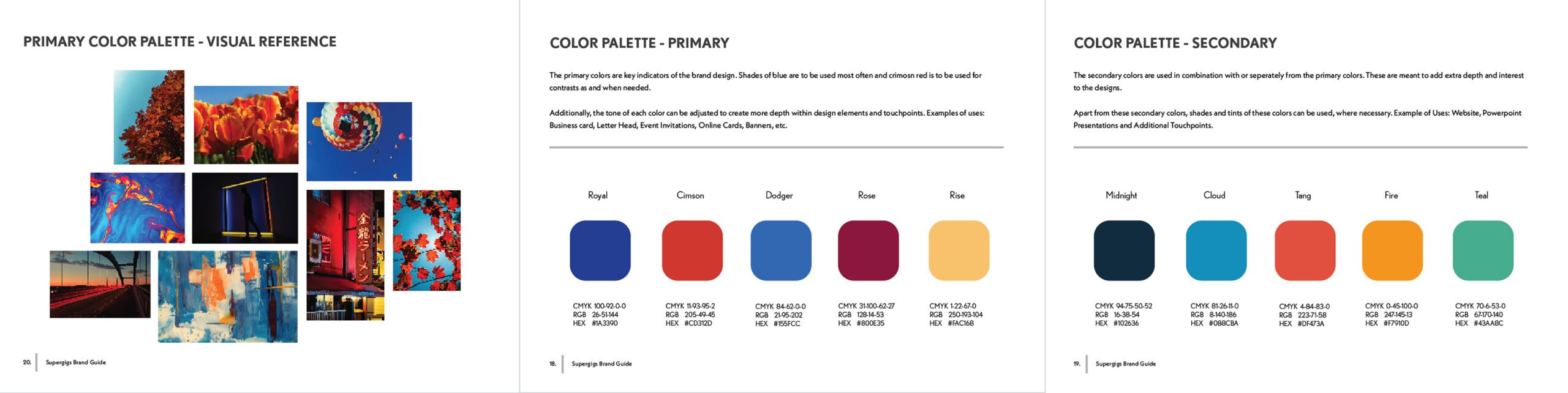
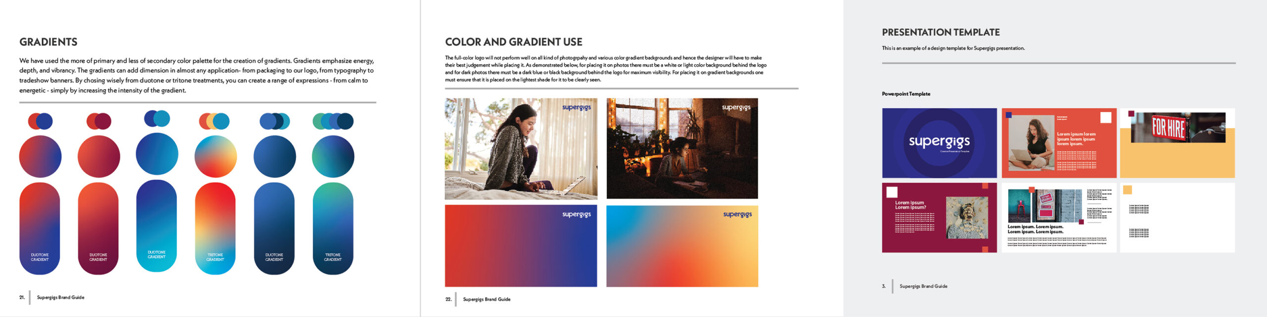
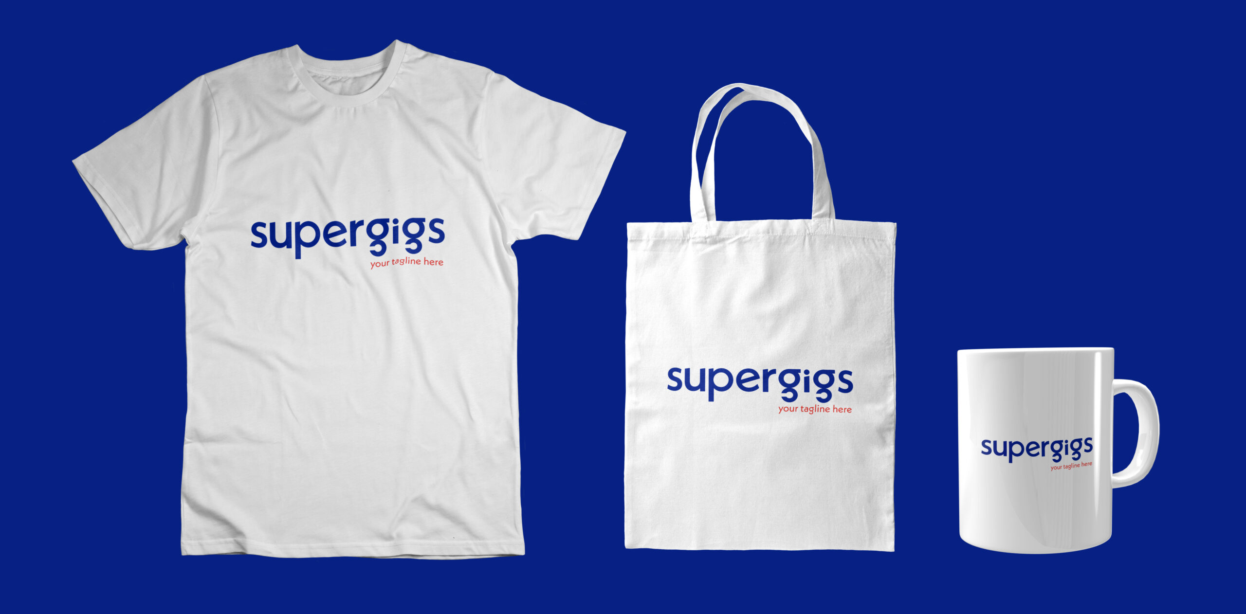
We took a minimal, bold, and trendy approach to the design, using blue and red as the primary colors to reinforce that superhero connection. The color palette and typography were carefully selected to appeal to the target audience and ensure the brand stood out among its competitors.